Case Study:
Controlling Privacy on Instagram
MY ROLE
Designer— discovery, user research, design, user testing
DURATION
2 months, March - May 2023
TOOLS
Figma
IDEA
Instagram is one of the largest and most popular social media platforms used today. Social media is a great method to connect with others and share a range of events in your life, from daily one to special occasions. However, what if you don’t want to share everything with everyone?
From studying Environmental Psychology, I was able to learn about how the design of environments can facilitate privacy control. Controlling privacy is an issue for everyone as they constantly search for the optimum amount so that they do not feel too isolated or too exposed. The question about how we would control privacy in online environments led me to this case study, as social media could be an online version of the social environment we live in today. The boundary of how private or public you want to be on your social media differs for everyone and balancing how open or closed you want to be on social media is an issue many users face.
PROBLEM
When I post content on instagram, I want to manage the publicity of my posts to my followers, so I can express myself to others who are at different levels of relationship. But I can’t do that well because
All my followers each at different ranges of closeness can see all of my posts
I want to keep privacy and engage in social interaction at the same time
USER RESEARCH
I interviewed some of my peers to gain a better understanding of how they balance privacy and publicity on their instagram accounts.
Key trends and insights:
Users had two or more accounts for different levels of closeness/privacy — Users want to control their level of social interaction by different levels of closeness; they want to disclose different levels of information
Users chose photos based on “worthiness” to post — Users want to choose the best moments that will receive good reactions from their followers
Users tended post less often and used stories instead — Users are hindered to post and themselves to their followers often, leading to use a more light method, the story.
BRAINSTORMING
I recruited two fellow designers, Christina Jin and Jade Eggleston to help me brainstorm possibles solutions.
6 Solutions
After an intensive brainstorming session, we were able to come up with these solutions:
Create different boards and allow users to select people who can see the boards
Have public, private, personal feed
Allow to lock posts for certain viewers only
Create a group feed that users can collaborate on
Create a second profile
Enable private comments
NARROWING IT DOWN
Through an analysis of the feasibility and impact of each solution, I was able to narrow my solutions down to three features to further develop:
1. Have public, private, personal feed — By categorizing the content, people can feel comfortable about the level of privacy or publicity they have with their posts. The private feed would only be available to people you add to your close friends list.
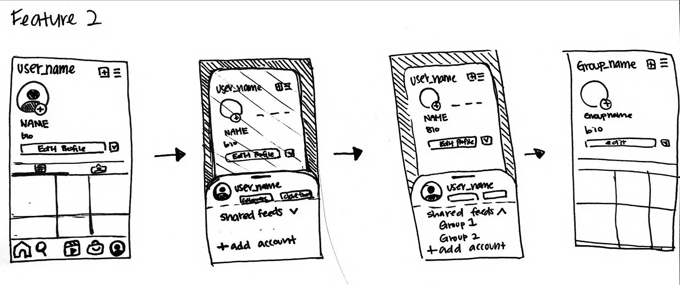
2. Create a group feed that users can collaborate on — By allowing collaboration, people can work on a feed together or allow only certain people to see those posts, which they are able to more effectively control privacy.
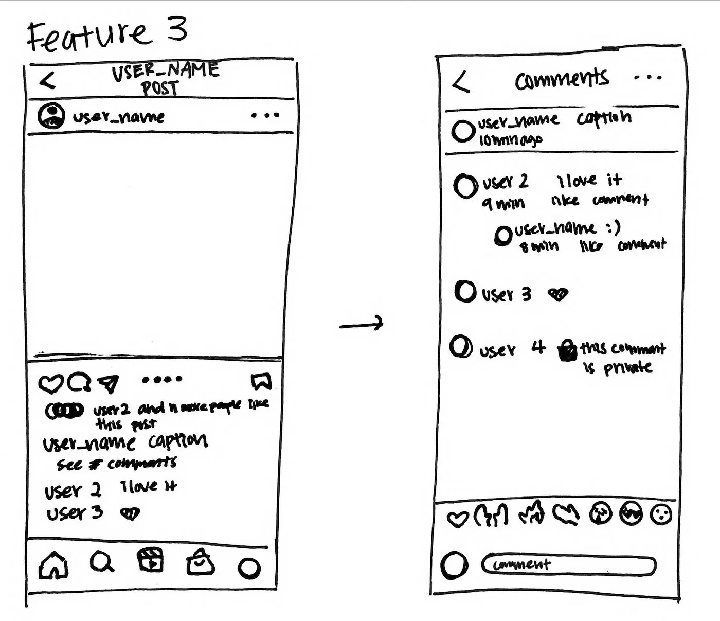
3. Enable private comments — By controlling privacy of certain posts or comments by selecting the group of people they want to lock their content to, people will feel more comfortable uploading diverse content.
SELECTED FEATURE
To solve the people problem, I felt like Feature 1 was the most feasible and tackled the problem more than the other solutions. From the interviews, it seemed like the content itself was what hindered people to upload, more than the reaction of the public. They were more reluctant to others just viewing their private content rather than their followers’ reactions on them, which made Feature 3 a less viable option for this people problem. Feature 2 also tackled the problem but it would be less feasible as it divides the content to too much categories, changing the use of the app to more of a group chat style function. Therefore, I decided to develop Feature 1 as it divided the privacy of the content while not delineating too much from the purpose of this application.
EXPLORING FLOWS & MID FI
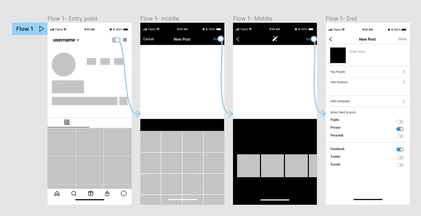
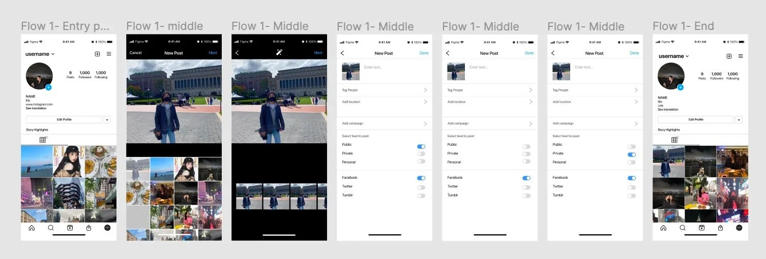
Flow 1
Entry Point: This entry point is reasonable because it is where people upload new posts, which is going to be located in one or more of the separated feeds.
Middle: Part of the process of uploading new post
Middle: Part of the process of uploading new post
End: This is where they can choose on which feeds they could upload. If the user completes this task, the post would upload in the selected feeds. This flow would provide sufficient feedback and would be somewhat intuitive.
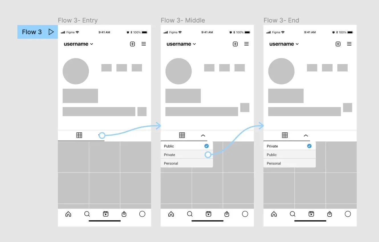
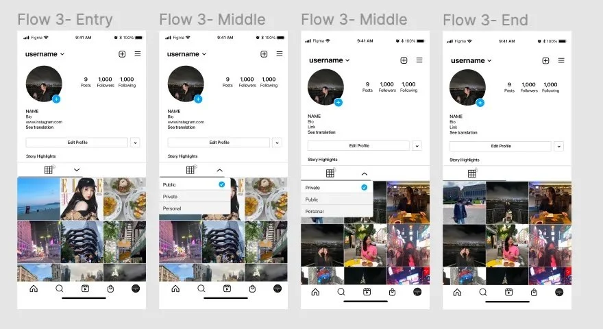
Flow 3
Entry Point: I chose this entry point because the icon selected is the feed icon, which is intuitive for the users. The entry point should be prominent compared to flow 2.
Middle: There would be a drop down that people can click on.
End: When the task is completed, users would be able to see their private feeds, or the feed they decided to switch to using that feature. This also provides proficient feedback and would be the most simple.
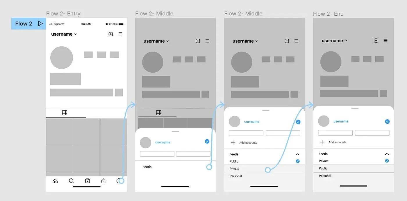
Flow 2
Entry Point: I chose this entry point because the profile icon is where you can switch profiles between multiple accounts, which might be an intuitive entry point for switching feeds as well. However, the entry point is relatively hidden.
Middle: The menu pops up from the bottom and shows the feeds dropdown. The dropdown makes the section more organized.
Middle: When you open the dropdown, the different feeds show, which you can choose to view.
End: When the user completes the task, the public feed changed to the private feed and they are able to view the feed that they selected from the dropdown. This provides sufficient feedback as they can see the immediate change from their profile page.
USER TESTING
After developing the 3 flows I decided to proceed with during mid-fidelity, I conducted user tests in order to:
Identify the successes and failures of each flow
Identify which flow is the most intuitive and why
Identify which flow is the most efficient
The users were presented 3 different high-fidelity prototypes and were asked to navigate their way from their public to their private feeds.
Prototype 1
Prototype 2
Prototype 3
KEY FINDINGS
Users tended to navigate Prototype 3 the easiest (3,1,2 in order).
Users were most confused on Prototype 2, especially on what to click for the entry point.
Many users gave feedback that Prototype 1 would be a good addition to Prototype 2 or 3, while it shouldn’t be the only flow.
FINAL FLOW
From the key takeaways from my user tests, I was able to decide on my final flow from the feedback I got from user tests by combining Flow 1 and Flow 3 together. Although the main flow I chose to develop was Flow 3 since it was the most intuitive and efficient, I added Flow 1 to make the final prototype more comprehensive of the actions users take to upload a post and the find it on their feed. The video on the top of this page is a video prototype of the final flow.
WHAT I LEARNED
From working on this case study, I was able to take away valuable lessons that would help me design in the future such as thinking flexibly in order to find the best solution for user flows. Through processing through many brainstorming ideas and medium fidelity iterations, I also learned the importance of open mindedness and how trying out everything is important. As this was my first UX case study, there is a lot of room for improvement but I definitely enjoyed working on it and enjoyed applying what I learned from a class about environmental psychology in the physical environment to the online or virtual environment.


