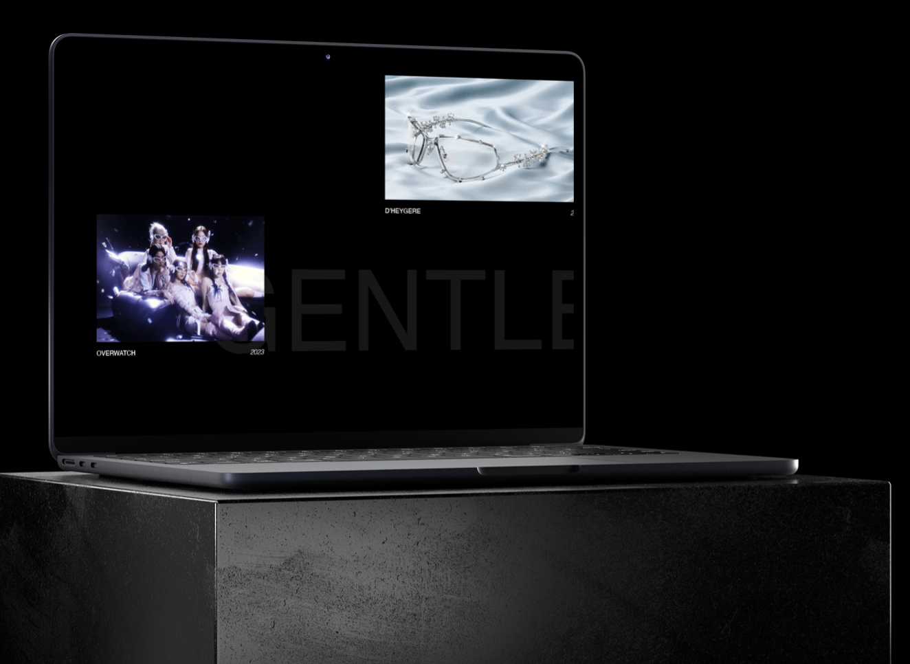
BX MICROSITE: GENTLE MONSTER
Web/UX Design, Front-end Development, Design Strategy
*This website will only work on 1960x1080 screen size PC/Desktops.
OVERVIEW
MY ROLE
Designer— discovery, user/brand research, design, user testing
Developer— front-end development using HTML, CSS, Javascript
DURATION
4 months, Oct 2023 - Jan 2024
TOOLS
Adobe Photoshop, HTML, CSS, JavaScript
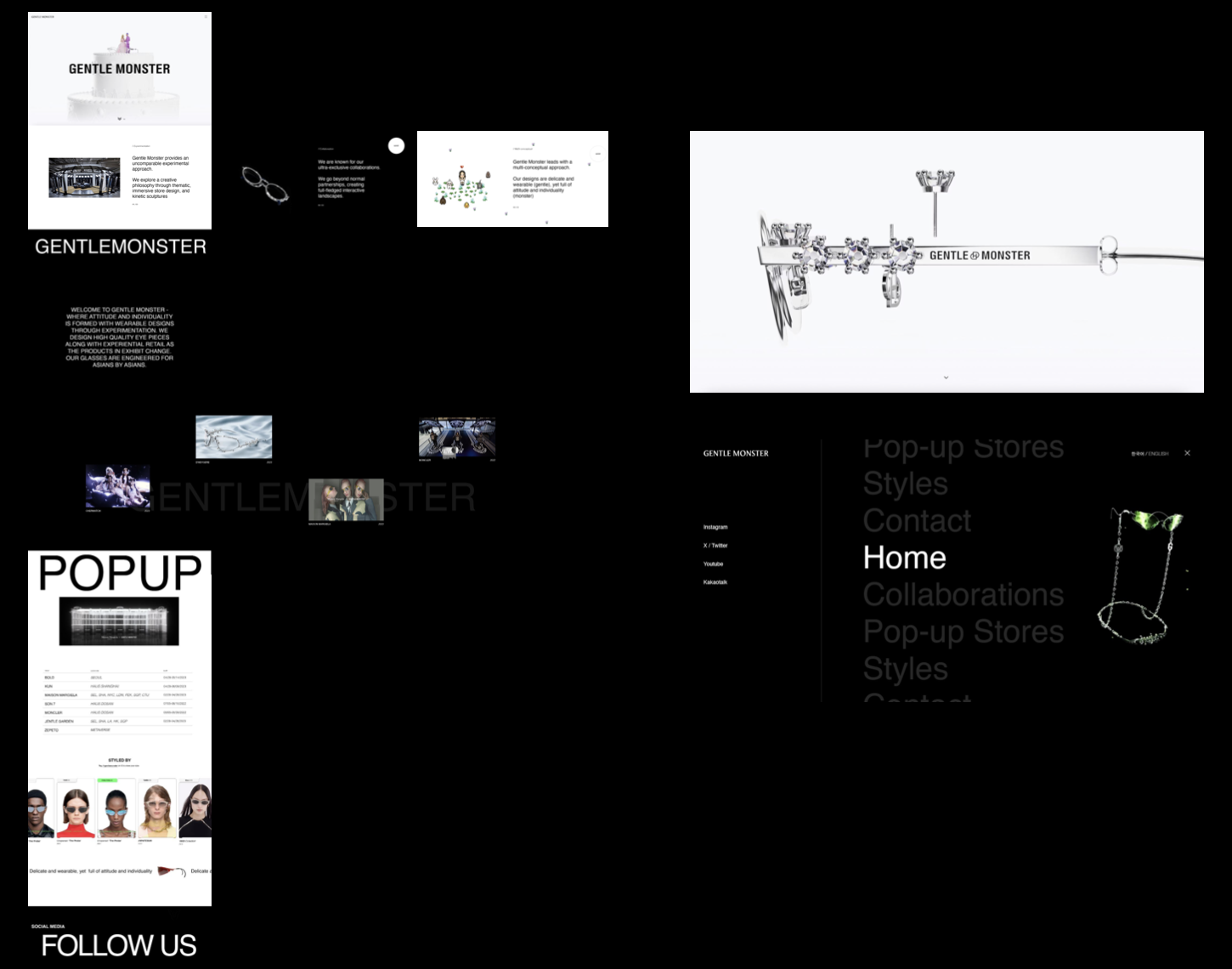
FINAL PRODUCT
TOPIC DISCOVERY
Brand study side project on a brand I thought had great branding
Led to SWOT Analysis
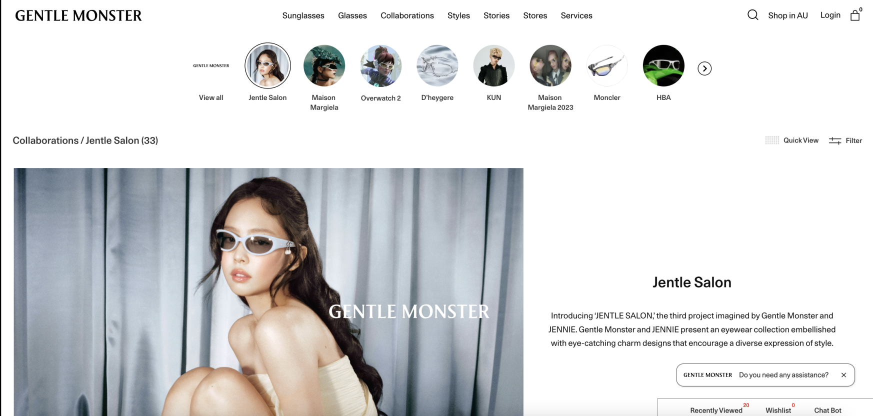
Found out User pain point on website, leading to this project
Decided to create a microsite for it to synthesize the technical skills I acquired from my internships and university
TIMELINE
SWOT ANALYSIS
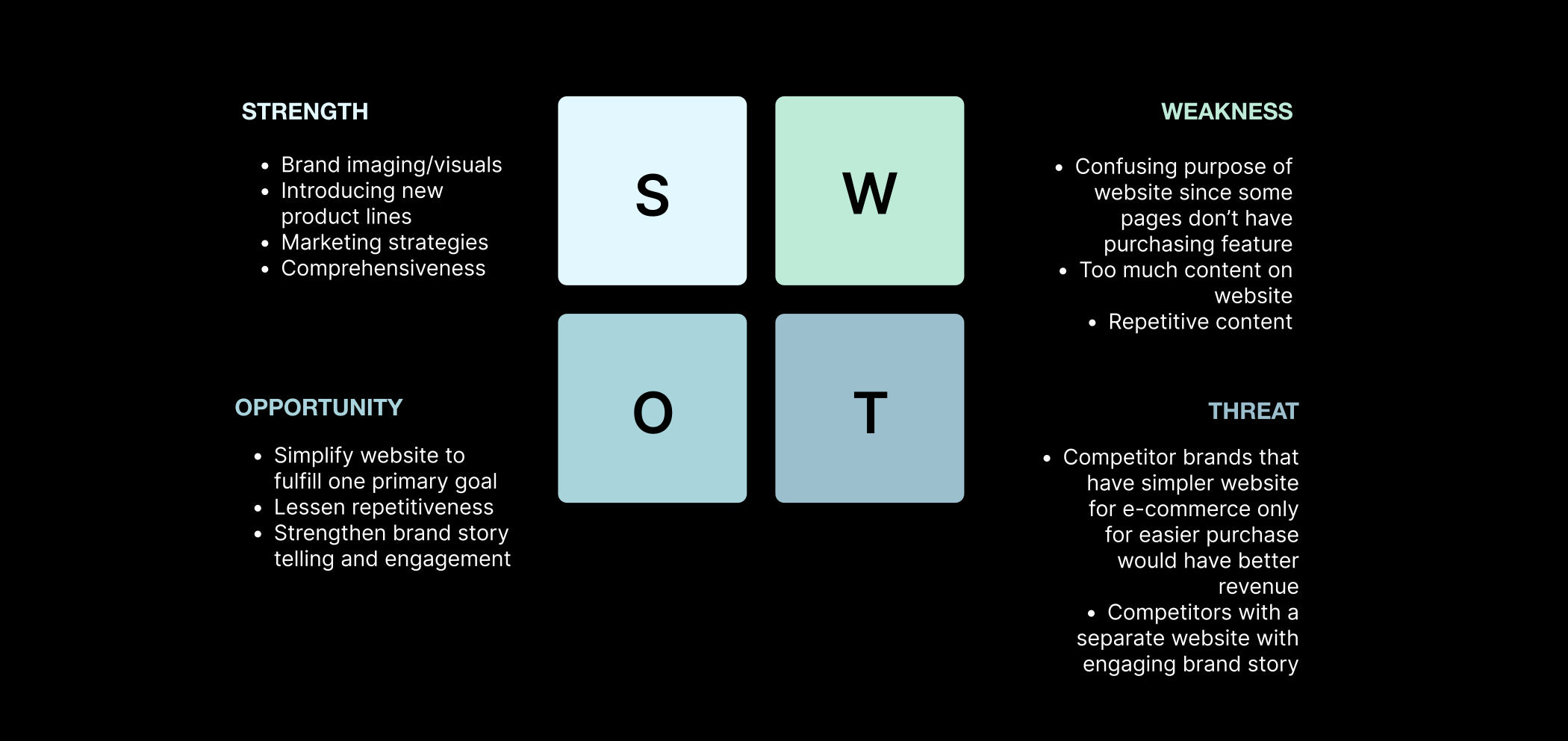
I conducted a SWOT analysis for the brand website of Gentle Monster, so I can know its strengths, weaknesses, opportunities, and threats in order to learn what decisions were made in their website
USER INTERVIEW
With the result from the SWOT Analysis in mind, I conducted a total of 7 user interview asking interviewees to navigate the original website to find out the following:
How well can users navigate through the original website?
What do users want to change in order to enhance the usability of the website?
Are the strengths and weaknesses I identified objective or subjective?
PAIN POINTS
Analyzing the results from the interviews, I identified the following pain point in the website:
The current website has too many paths, distracting the user to focus on one primary aspect or goal in the user journey because e-commerce, collaboration, store design, and branding are all equally emphasized. There are also a lot of repetitive material that confuses the user.
SOLUTION PROCESS
01 Competitor Analysis
02 Synthesis
BENCHMARKING/COMPETITOR ANALYSIS
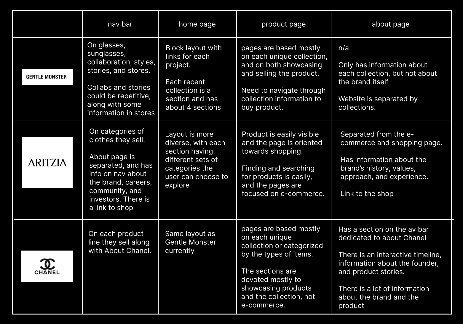
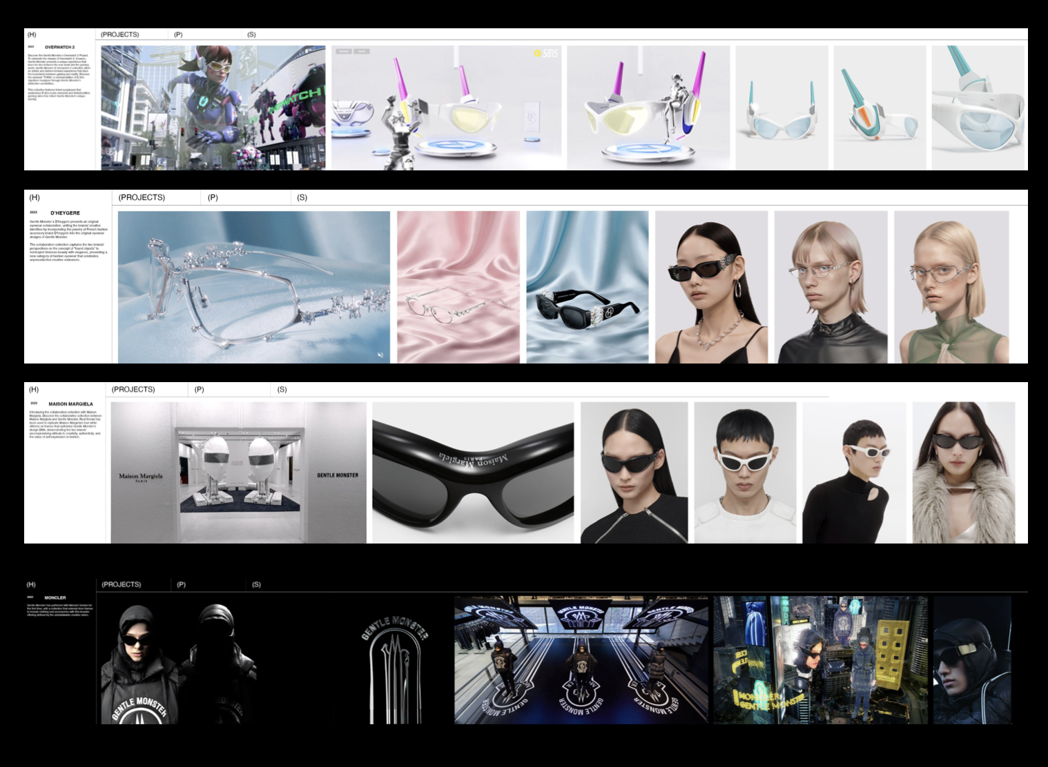
I engaged in competitor analysis to research what other brands were doing in order to declutter the content on their website and foster a clear user journey. I chose to do the competitor analysis on the brands I thought had a similar style of black and white, minimalistic, website branding like Gentle Monster. Although Gentle Monster is a mid-high end brand which is different from the two brands I chose, since it is in the middle range of the two brands, an effective design would be produced by incorporating the features of the two.
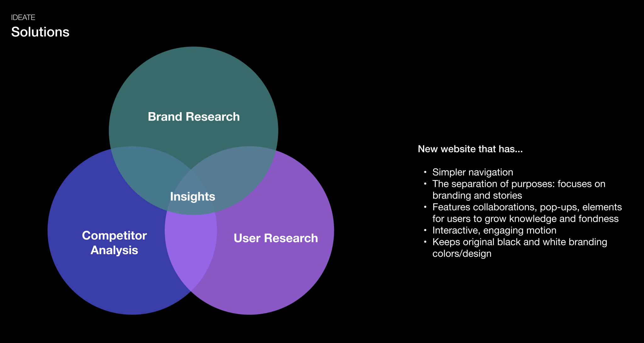
SYNTHESIS/SOLUTION
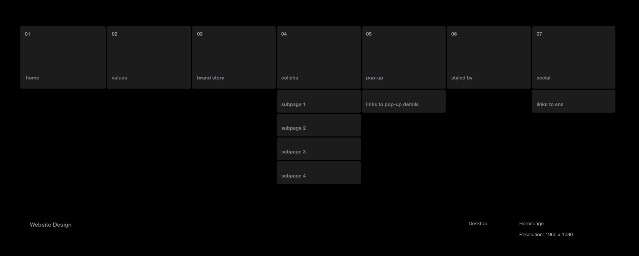
INFORMATION ARCHITECTURE
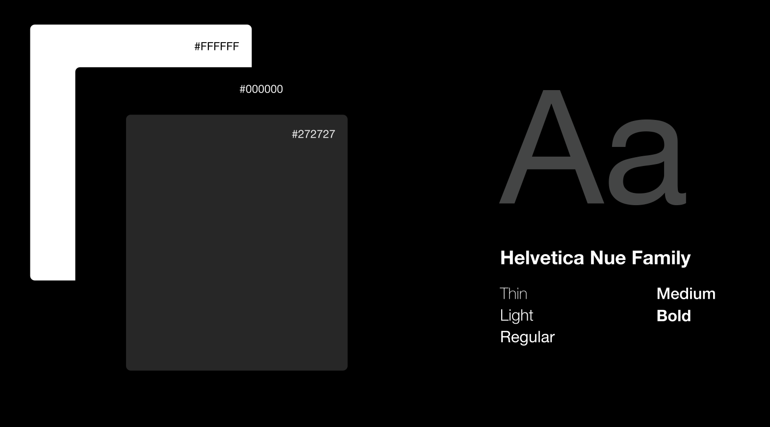
UI DESIGN
LO FI SKETCHES
I started off with some sketches of the website according to the information architecture diagram, and chose to refine this sketch to go on with the mid-fi iterations below
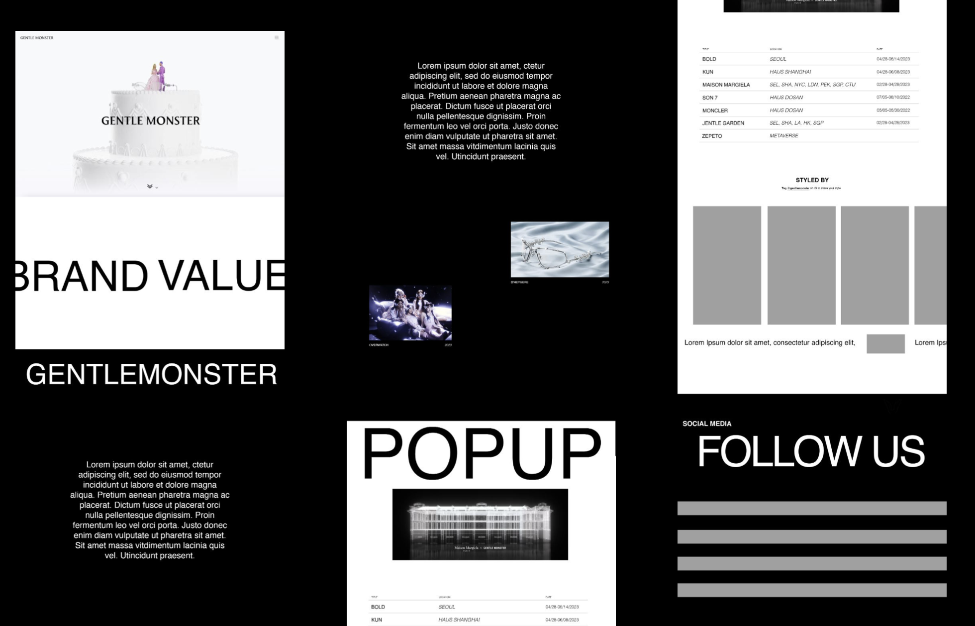
MID FI ITERATION
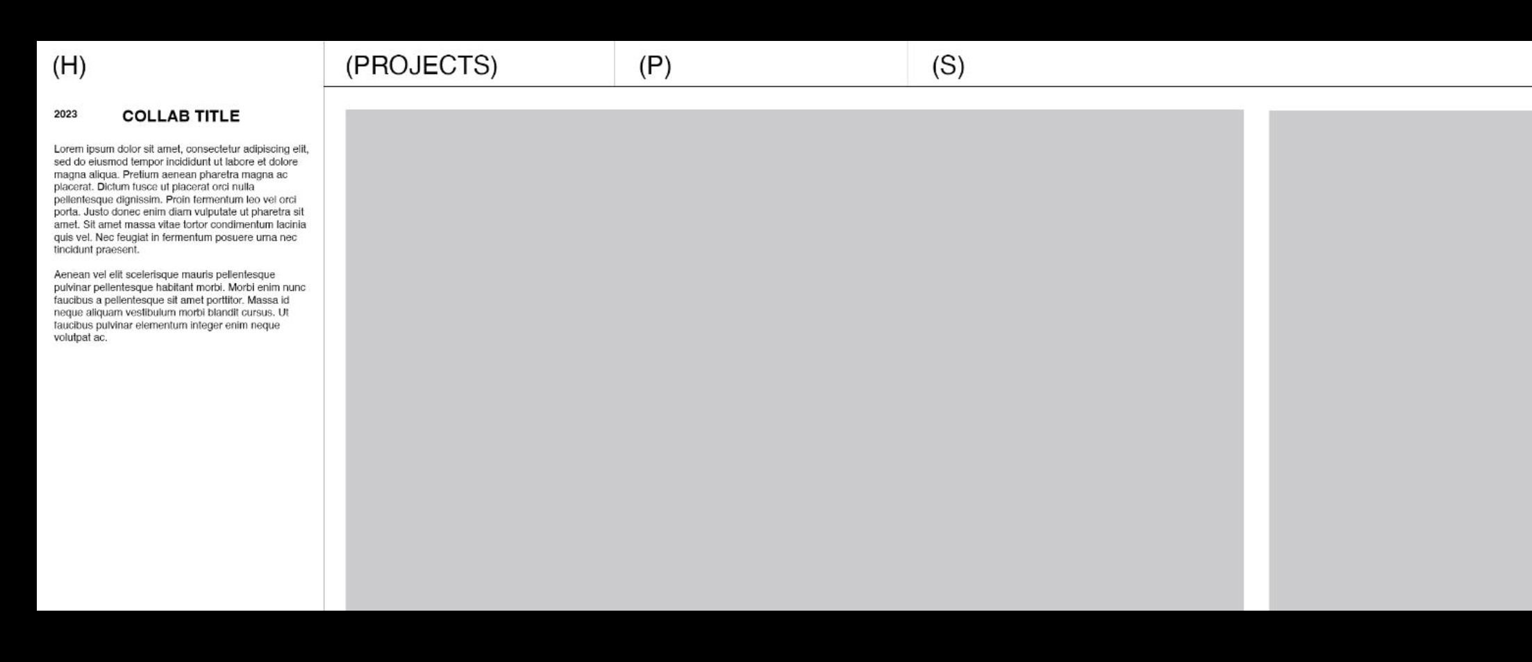
MID FI SUB PAGE ITERATION
USER TESTING 1 INSIGHTS
I conducted user tests with my mid-fi iterations since I had the prototype follow the information architecture I devised, having a set flow for the user journey to test before developing it into a hi-fi iteration
Users did not have major issues with navigating the website, and could find information about the brand easily as well, after their first scroll
Users wanted to add a link back to the home page from the sub pages for a more intuitive way to undo their mistakes in navigation
Loading screen/video is too long and has too much white space
I created my high fidelity, final figma prototype using the insights derived from the user tests I conducted. This prototype would be used and followed during the front-end coding stages of the project.
FINAL FIGMA PROTOTYPE
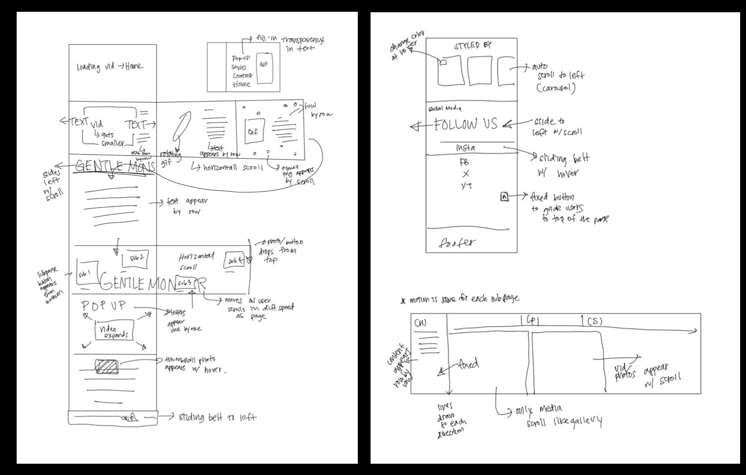
PLANNING MOTION/INTERACTION
After creating my final screen designs on Figma, I planned out the different types of motion I wanted to implement in order to make my website interactive and engaging before coding my actual website.
CODING/IMPLEMENTATION
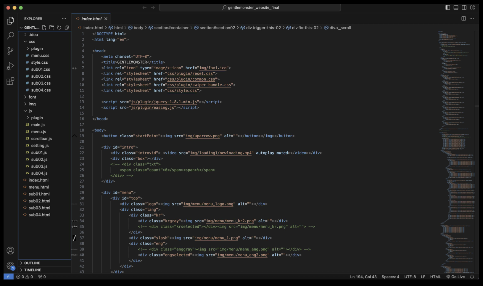
The next step was to use HTML, CSS, and JavaScript to code my website and implement my designs, along with the motion I planned.
USER TESTING 2 INSIGHTS
I conducted another set of user tests with my actual website in order to see how the users interact with the motion, learn if the users thought the website was engaging, and know if there are any improvements that could be made with the implemented website.
Users tended to navigate the page easily and found information well
Users thought that the motions and transitions of the website were engaging when asked to evaluate it on a scale of 1-10.
Users thought the screens in the bottom section were kind of bland and less interactive when the screens had a white background
FINAL PRODUCT
REFLECTION
What I Learned
Project and time management
Balancing my design style with the brand’s design styles
How to think precisely on planning transitions and motions of the website, which was an aspect that I usually did not have to be too specific on as a designer on a team with other developers
What I would do differently
Make website responsive to different screen sizes
More documentations of iterations during mid-fi, since I developed my designs on one file


