CONTEXT
Team: 1 PM, 1 TPM, 3 Product Designers, 3 Developers
Role: Product Designer
Duration: 2 Semesters (Fall 2021, Spring 2022)
ClubView is a product that helps Cornell students find clubs that match their interests or browse through existing or active clubs for the semester that they might want to join.
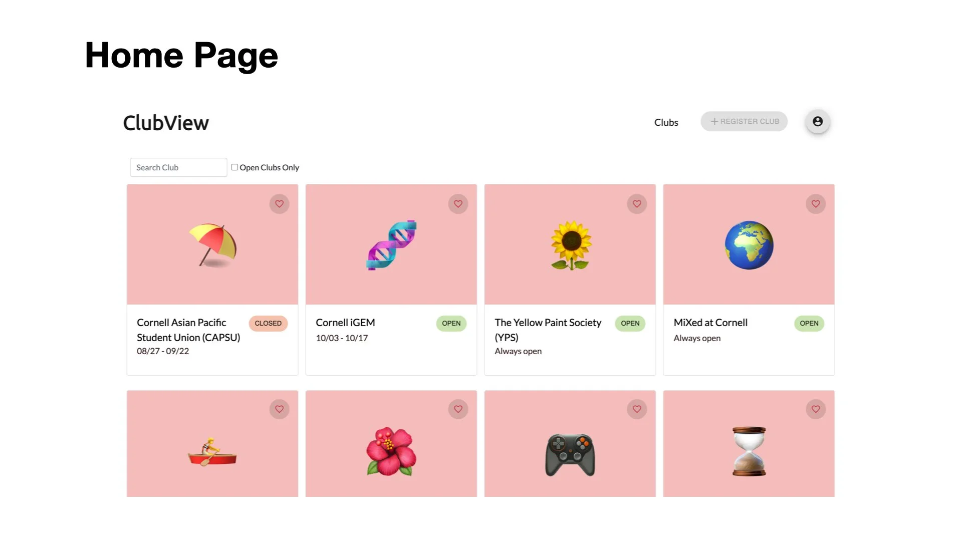
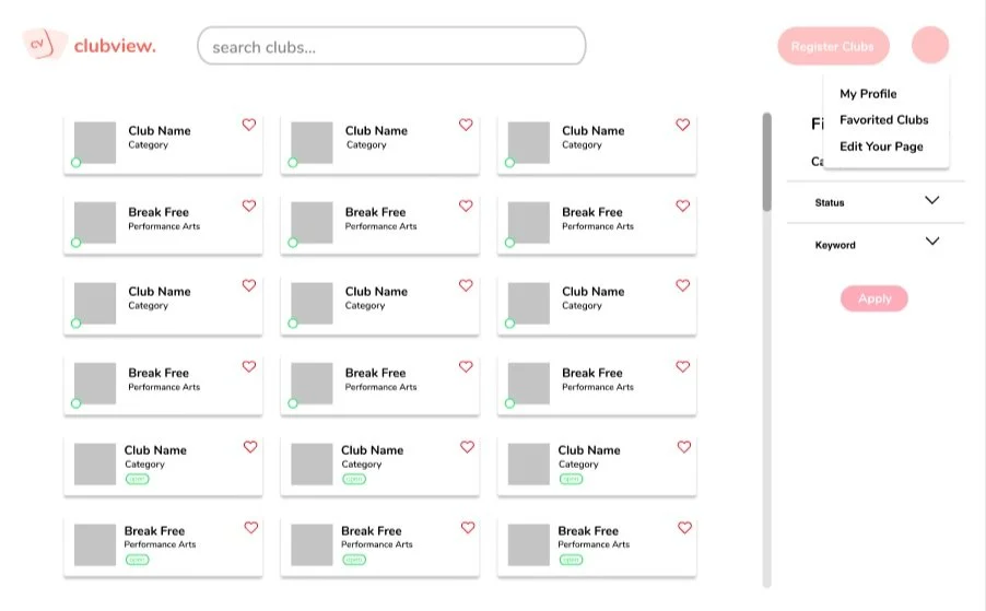
The design team’s purpose was to create a user friendly home page that made ClubView distinctive and competitive compared to other existing websites. The image left is a preliminary design of ClubView made by our TPM.
PART 1: HOME PAGE
PEOPLE PROBLEM
When I try to find clubs on the ClubView home page, it is difficult to find the information I need because
There is lacking amount of information on the cards compared to its size
The current design of the website is misleading as the hierarchy of important information is not established correctly.
USER INTERVIEW INSIGHTS
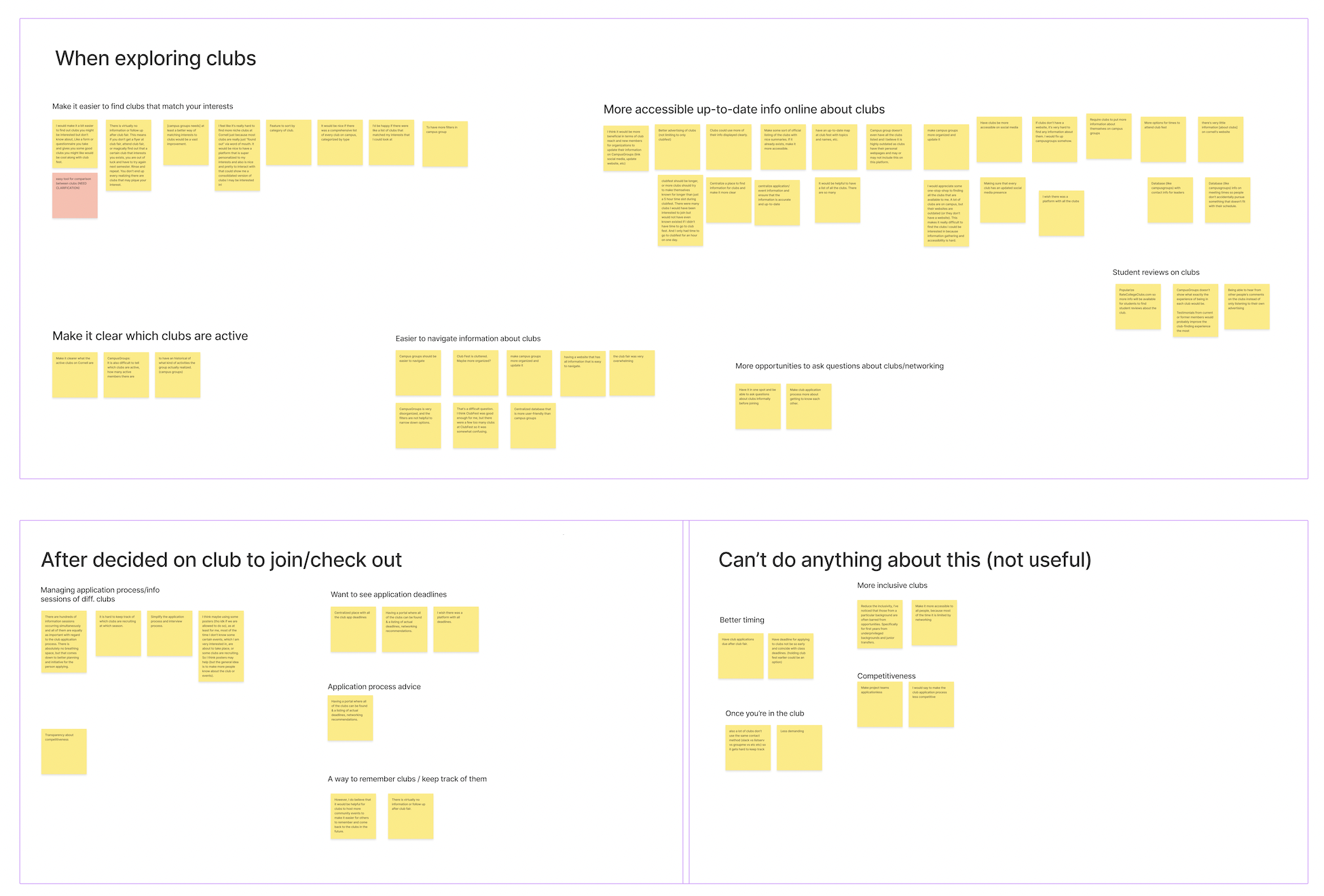
From the user interview, we were able to gain the following insights:
Users want to browse through potential clubs that they are interested in and see many items in one view.
There was an increase in interest in academic, professional, and project teams from a student’s time at Cornell vs before they came to Cornell indicates a strong interest in the student body in clubs that take applications
Many students have issues with the club search and application process with the existing methods
Hard to find information
Outdated information
Missed deadlines
Tough recruitment process
Overwhelming
Not enough information or opportunities to find information
Hard to keep track of events or find out about them
76% of respondents who are already in a club are open to joining another one, indicating strong continued interest in club search after students go through it
INFORMATION ARCHITECTURE
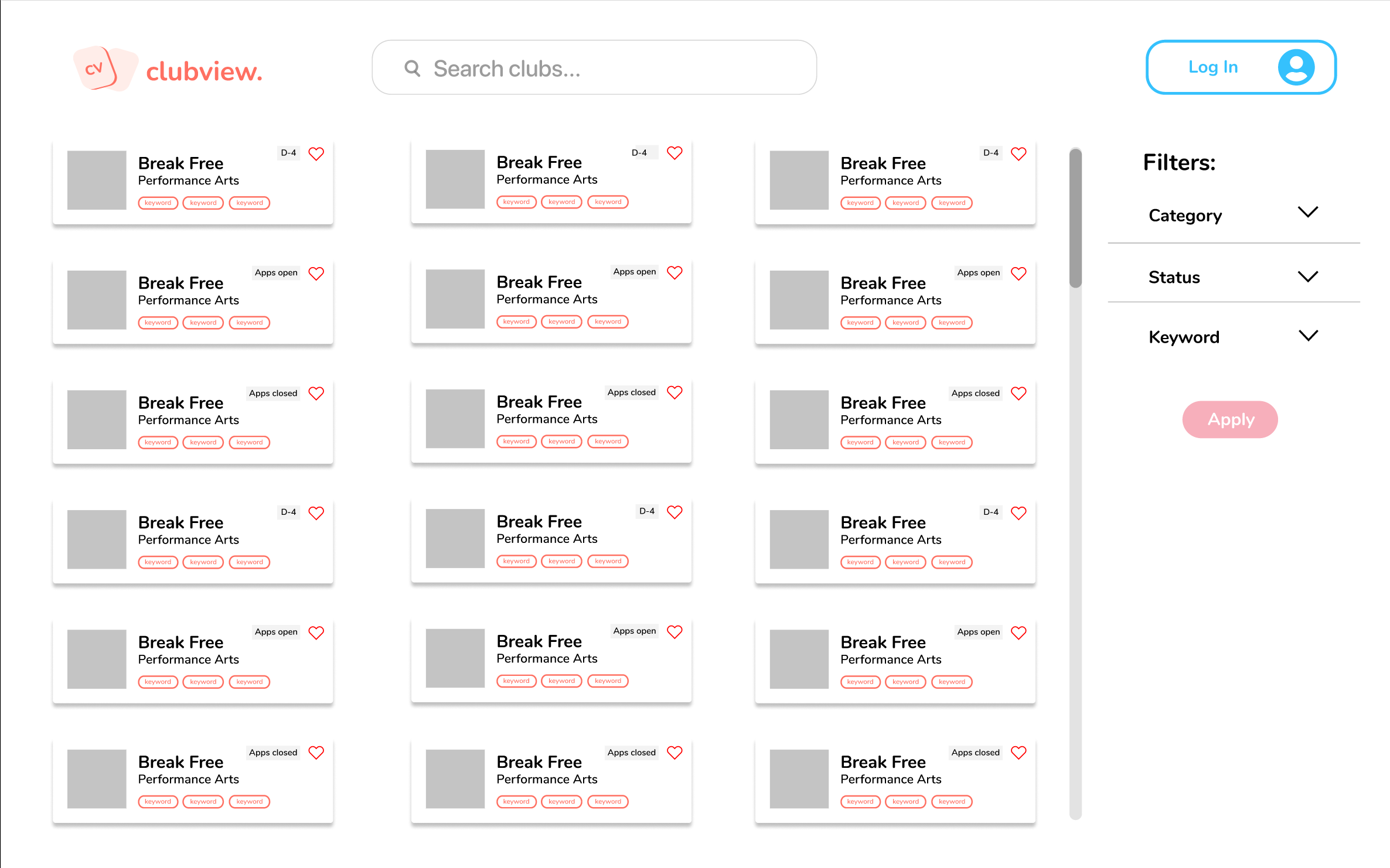
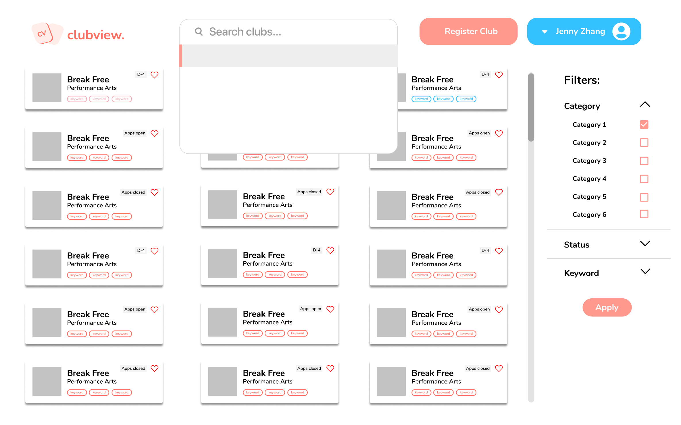
I started off with redesigning the club cards on the home page as they were the most crucial elements that determined the overall layout of the page. I made the filters and the search bar more prominent, and added the keyword tag feature to make browsing easier.
I focused on creating different iterations for cards, and decided to explore more with the smaller sized cards since they let the user see many different clubs in one ‘view’ in the home page.
LOW FIDELITY
MEDIUM FIDELITY
-
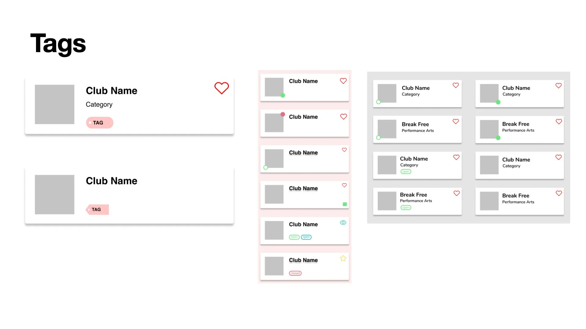
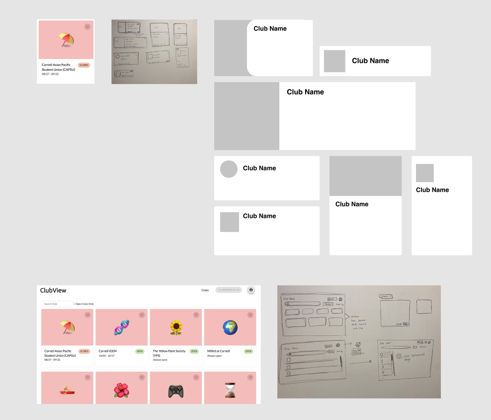
Tag and Card Iterations
These are some different iterations of the club information cards on the home page. I experimented with putting different amounts of information of the same size to see the most optimal design for the cards, as well as the visual design.
-
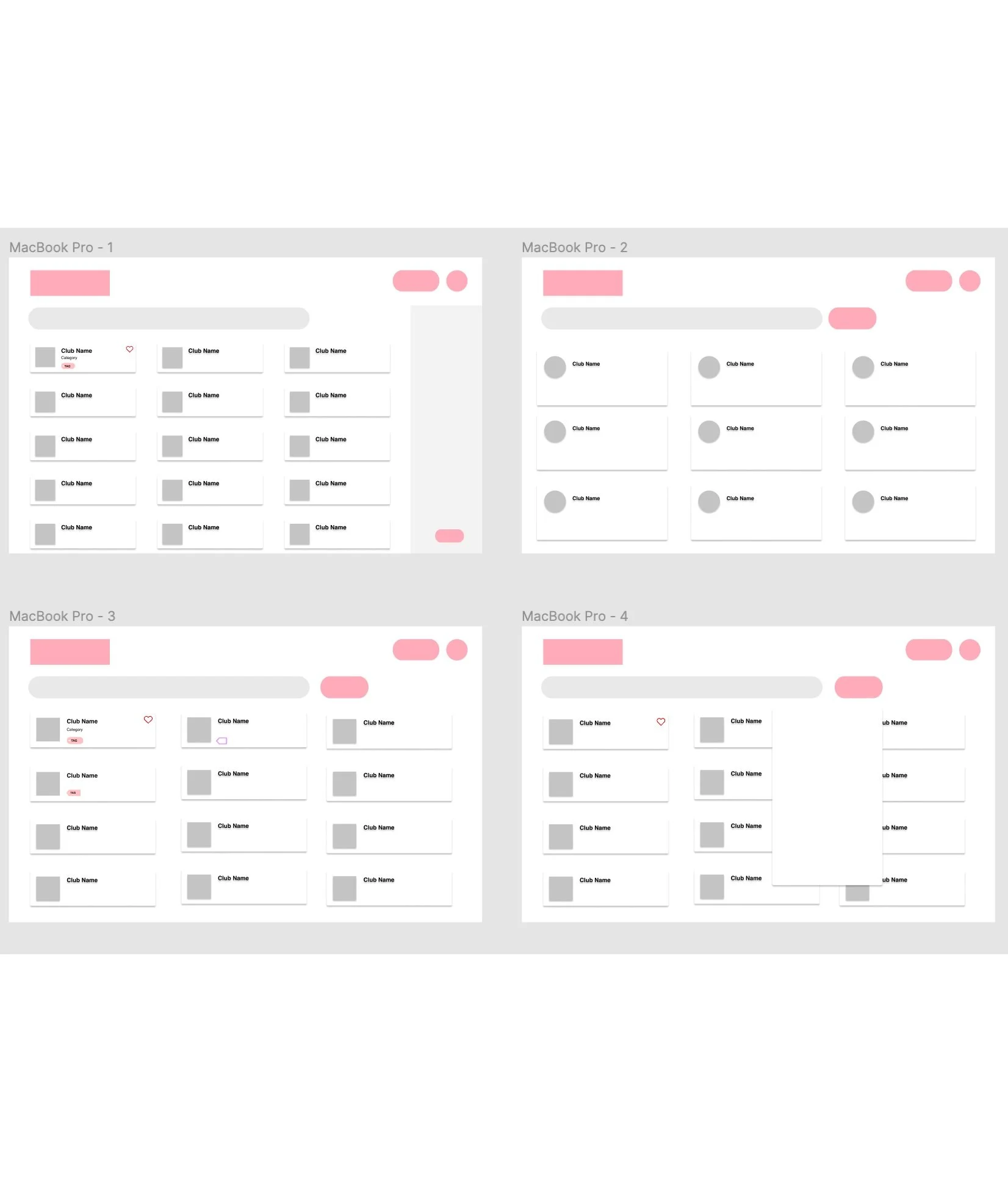
Home Page Versions with Different Amounts of Information
I also experimented with the home page and tried out different layouts. The number of cards displayed so that there isn’t too little or too much information in one view was the key, along with deciding where to place each content.
-

Chosen Mid-fi Design to develop
This design was the chosen mid-fi design during design crit, while the visual design was just tentative. Through a short talk with my teammates, we decided that this layout was the easiest to view with the maximum amount of information.
HIGH FIDELITY
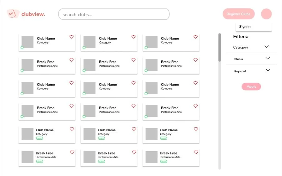
VERSION 2
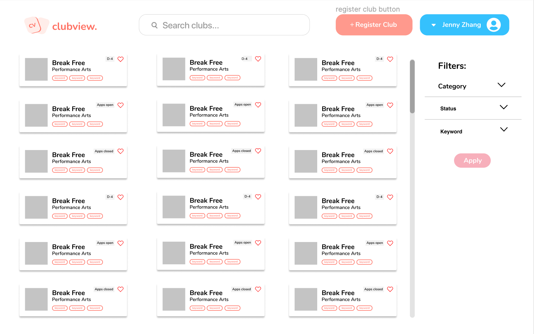
The second version was made after one more crit, when putting keywords or tags on the club preview cards was suggested. For this iteration, my co-designers and I came up with a color scheme for ClubView and decided on how the header would look like. I moved the status feature to the top next to the heart icon, while I still needed improvement on the tags because the information seemed too crowded, along with the color being too strong.
VERSION 1
I tried experimenting with the different ways to show club statuses, which was an additional feature our team chose to create. This feature would let users know if the club is open for applications or closed/inactive. I decided to move the filter feature to the side since this version was easier to use for most users who are right handed. I also made more iterations of the club preview cards on the home page, experimenting with the different forms to display information.
FINAL SCREENS
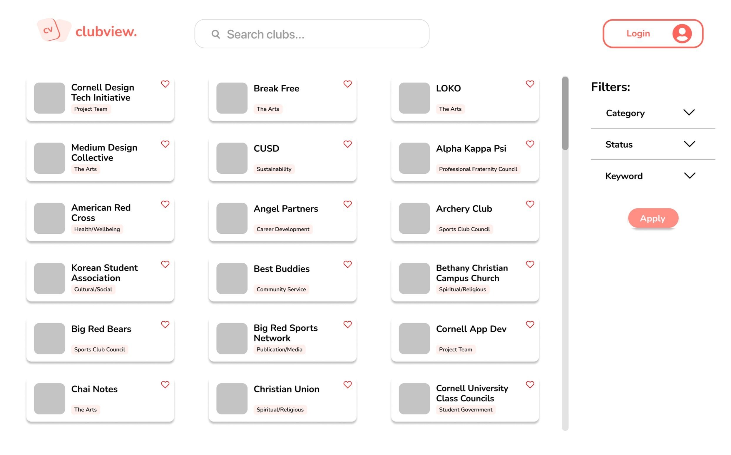
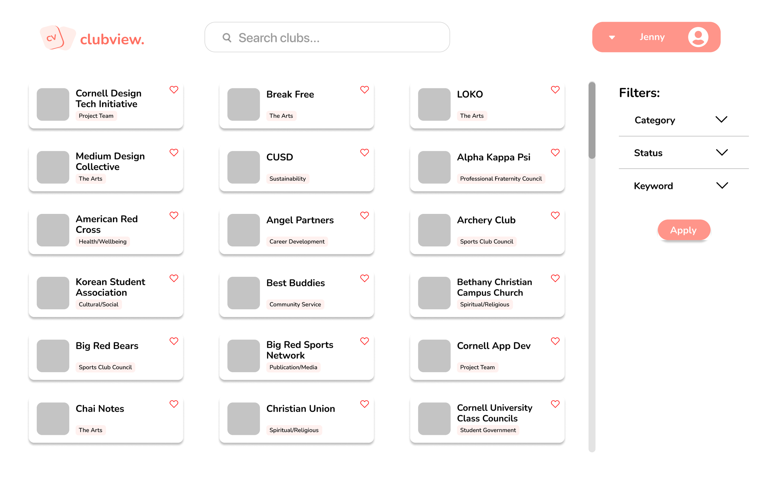
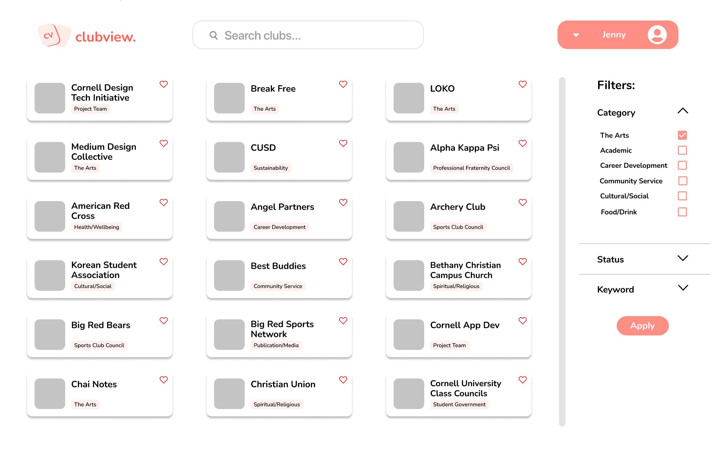
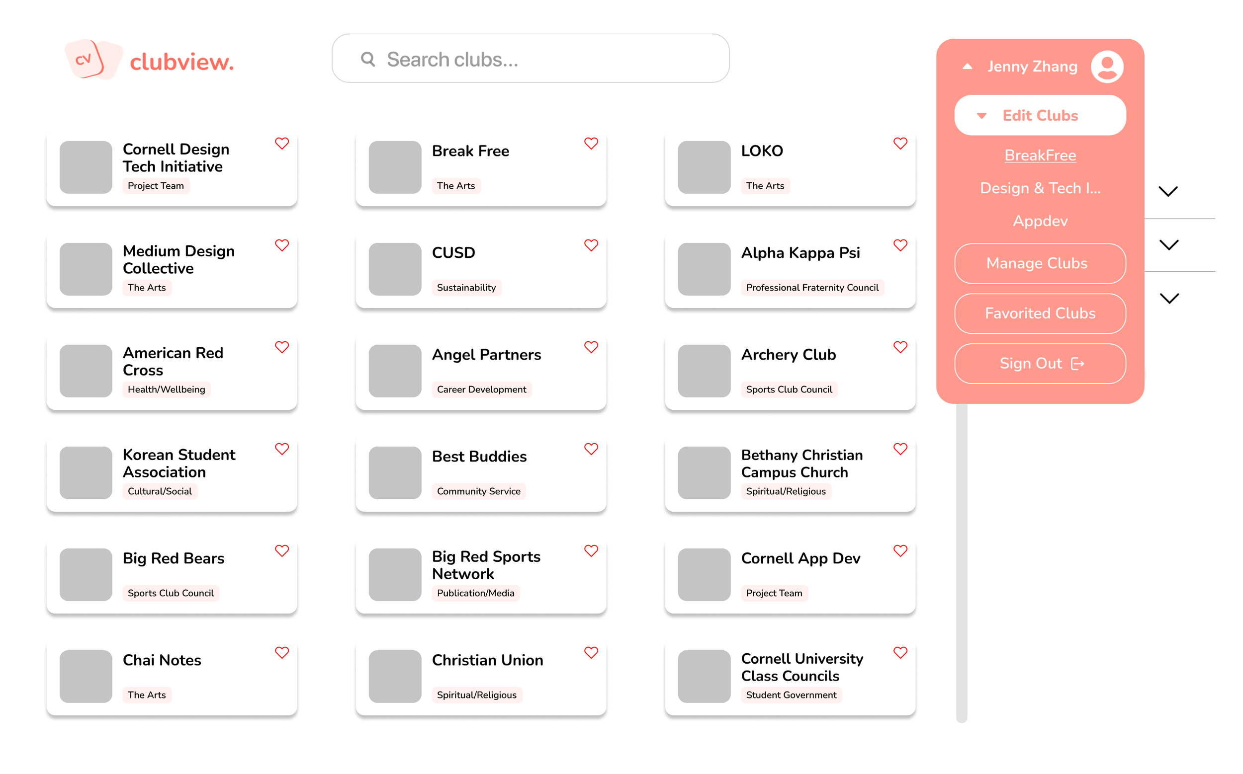
The iteration below is the final outcome of the home page for ClubView. For the final home page, I tried to make the page as simple as possible, since I got feedback from crit that only the most basic MVP features should be iterated for an MVP launch, and that clustering too much information decreases usability.

PART 2: FAVORITED CLUBS PAGE
CONTEXT
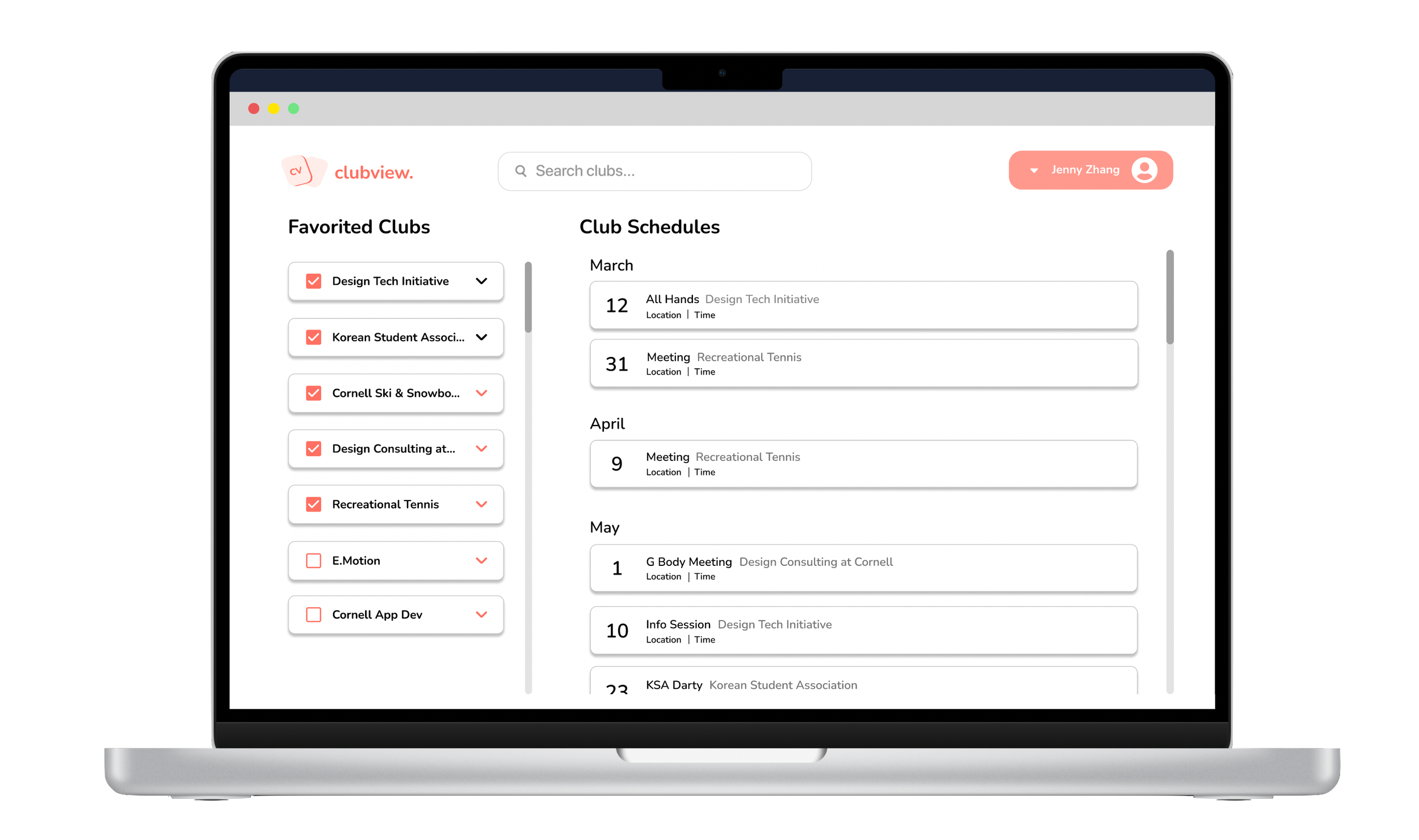
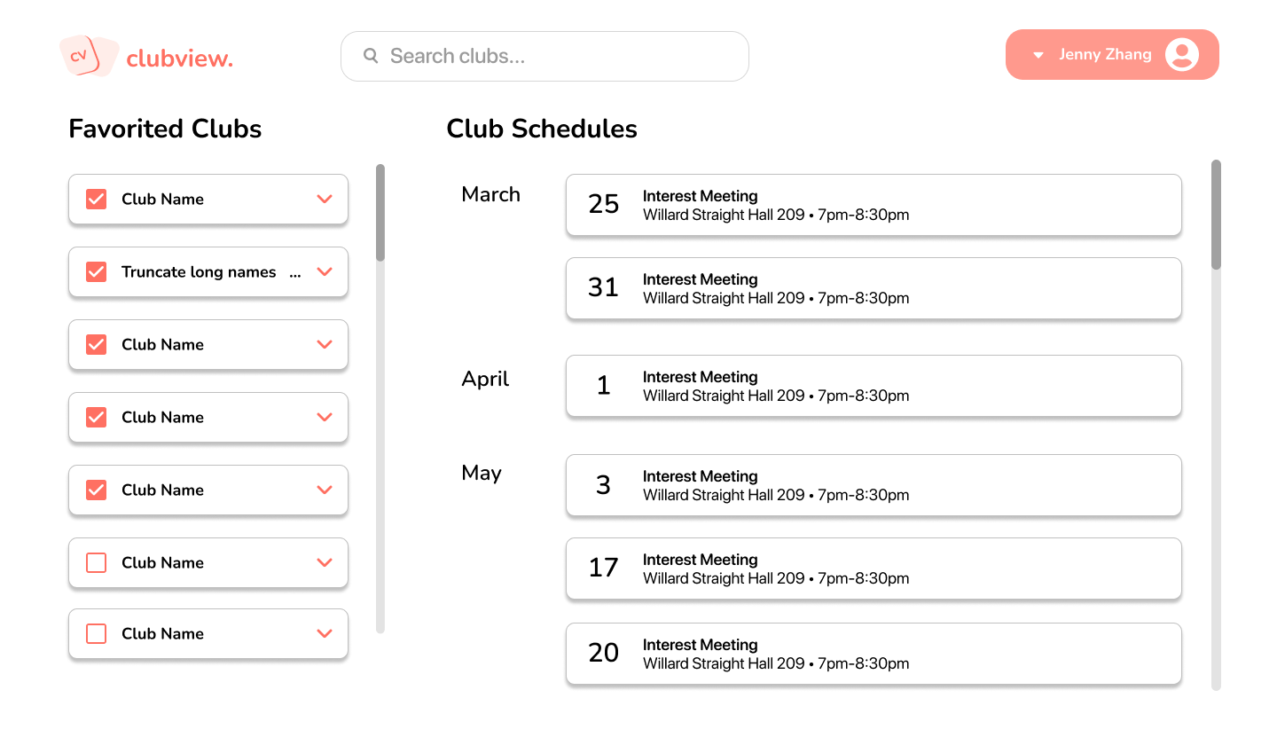
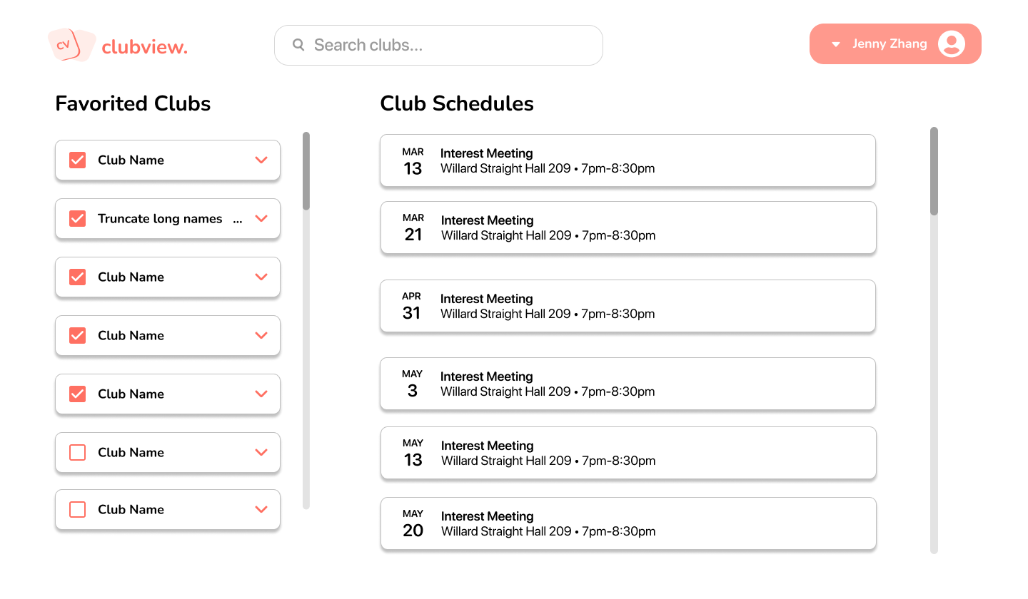
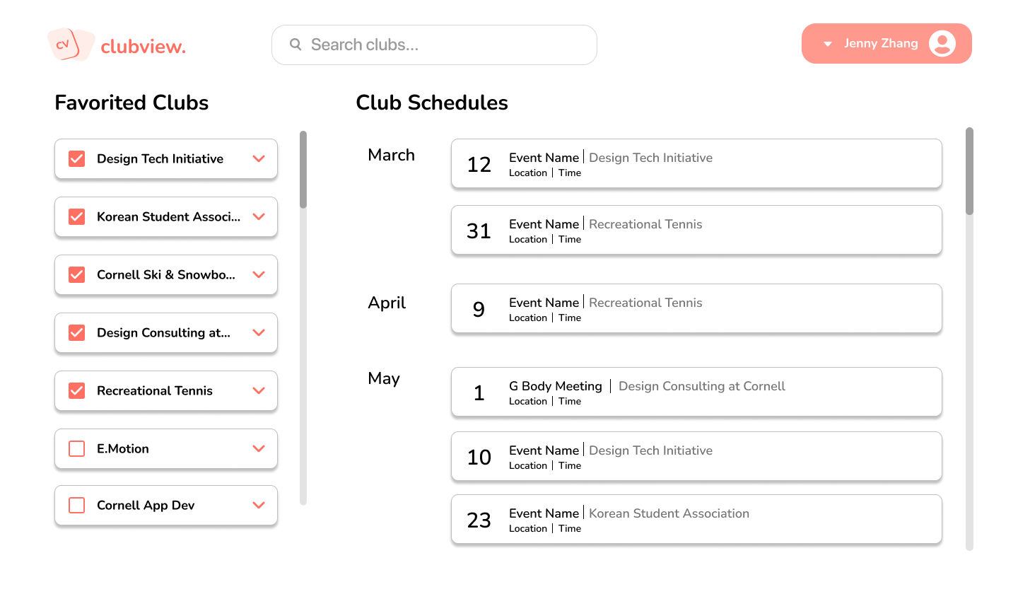
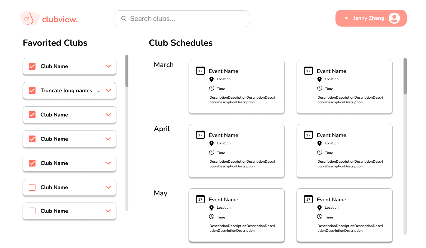
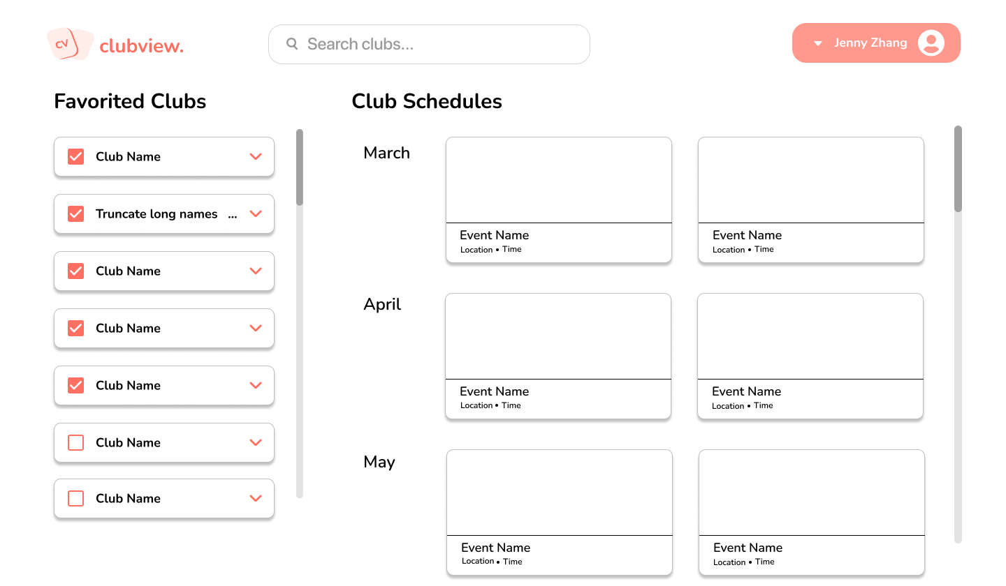
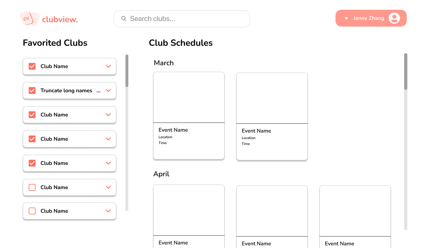
The Favorited Clubs page is a page that users can view all the clubs that they clicked the heart icon on and shows not only a brief description of the club in a mini dropdown, but also a list of those clubs’ events. They can select which clubs’ schedules they want to view and also unfavorite a club they lost interest in. ClubView unexpectedly got sunsetted while developing this feature due to an administrative decision that it could not compete with a new corporate product, and therefore only until mid-fidelity designs exist.
MEDIUM FIDELITY ITERATIONS
After conducting some market research about existing styles of the events page, I made iterations of different ways to display information about club events for favorited clubs in this page.


HIGH FIDELITY ITERATION
REFLECTION
Through this opportunity, I have learned the many considerations needed to build a product. I lave learned the importance of a designer-developer handoff and the interaction between them. I have also learned the importance of inclusivity and communication in a team setting, as collaboration and ideas from diverse people were important for a better product. Designing the home page helped me become better at simplifying my designs and choosing the right amount of information to display on my designs. The events page really helped me think about different ways to design for higher impact: how would we make people use this feature more than other events pages? Is there a way we can integrate the page with iCal or G-Cal for users to export their personalized events page? Adding on, it would have been nice to actually launch a product with our own designs as I started designing and building this product from scratch. This also helped me gain more interest in product thinking and product management, and I hope to be able to experience the launch process of the new product assigned to me.

